Quick Answer
Color theory helps you choose colors that work well together by explaining how they mix, contrast, and feel. It’s useful for everything from home decor to branding, helping you make intentional and pleasing color choices.
Key Takeaways
- Start with a neutral base (white, beige, gray) and add colored accents
- Use the 60-30-10 rule: 60% dominant color, 30% secondary, 10% accent
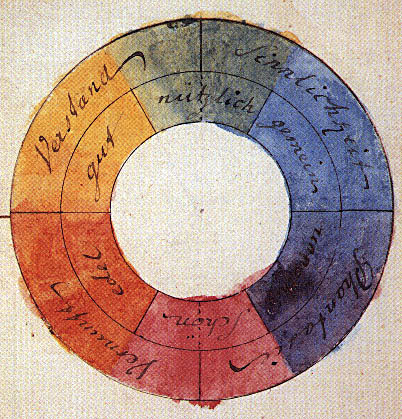
- Learn primary colors (red, yellow, blue) and how they mix to make others
- Choosing flattering makeup tones based on skin undertones
- Designing user-friendly websites with readable text and buttons
Troubleshooting & Solutions
Common Problems & Solutions
Why this happens
Monitors, phones, and tablets display colors using RGB (red, green, blue), while physical objects reflect light based on their pigment. Lighting also changes how we see colors—natural daylight vs. indoor bulbs alter perception.
How to fix it
- 1Calibrate your monitor if you're a designer or photographer
- 2View digital images in natural daylight before making decisions
- 3Use printable color swatches when testing paint or fabric
Mistakes to avoid
- Relying solely on digital previews without real-world testing
- Ignoring lighting conditions when evaluating color choices
Frequently Asked Questions
The three basic schemes are monochromatic (different shades of one color), complementary (opposite colors on the wheel), and analogous (adjacent colors). Each creates a distinct mood and level of contrast.
Sources & References
- [1]Color theory — Wikipedia
Wikipedia, 2026